
Kharkiv Sokoly
- Client: BC Kharkiv Sokoly
- Location: Ukraine
- Year: 2018
Speed and precision. A fight for every ball, for every rebound. From above — straight to the target. From the top, into the hoop. Uncompromising hunters who forgive no mistakes from the opponent. A swift gaze and vision of the battlefield. A flap of the wings, soaring through the air, and coming down with force. A game where there can only be one winner. The ball in the claws, the ball in the basket.
The club was founded based on the Kharkiv Higher Air Force Engineering School. The historical color of the club is blue. The sky. And we added orange. The ball. This is how the club’s official colors came to be.
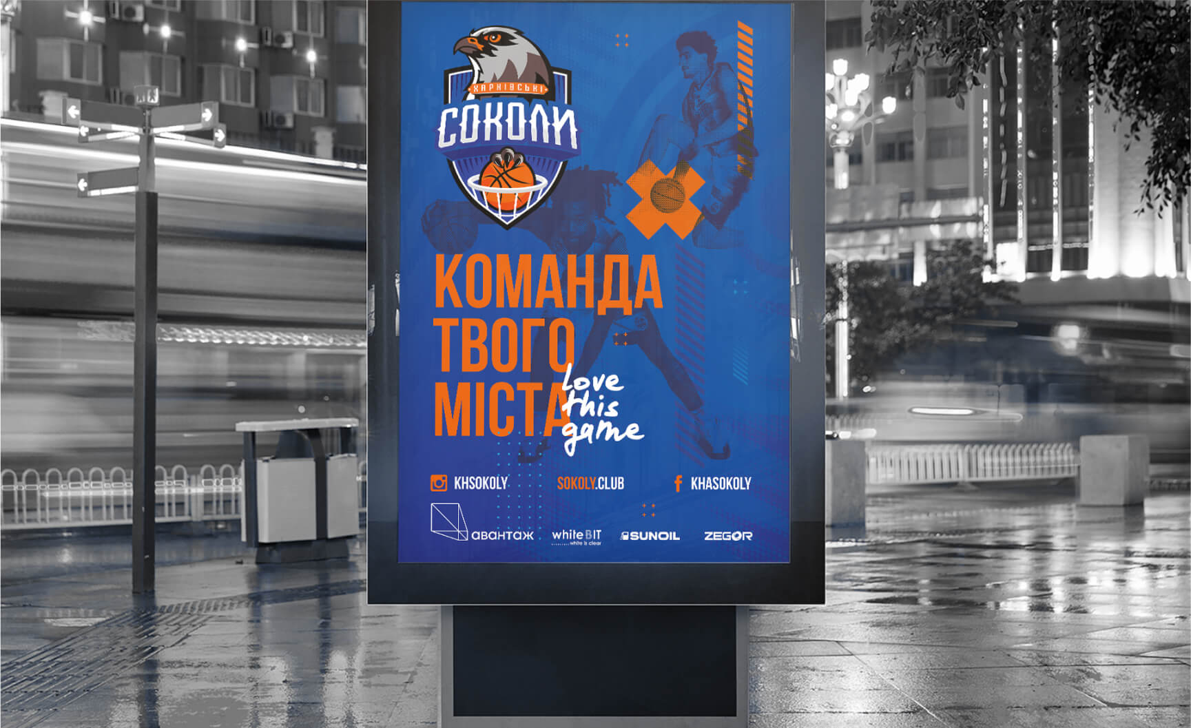
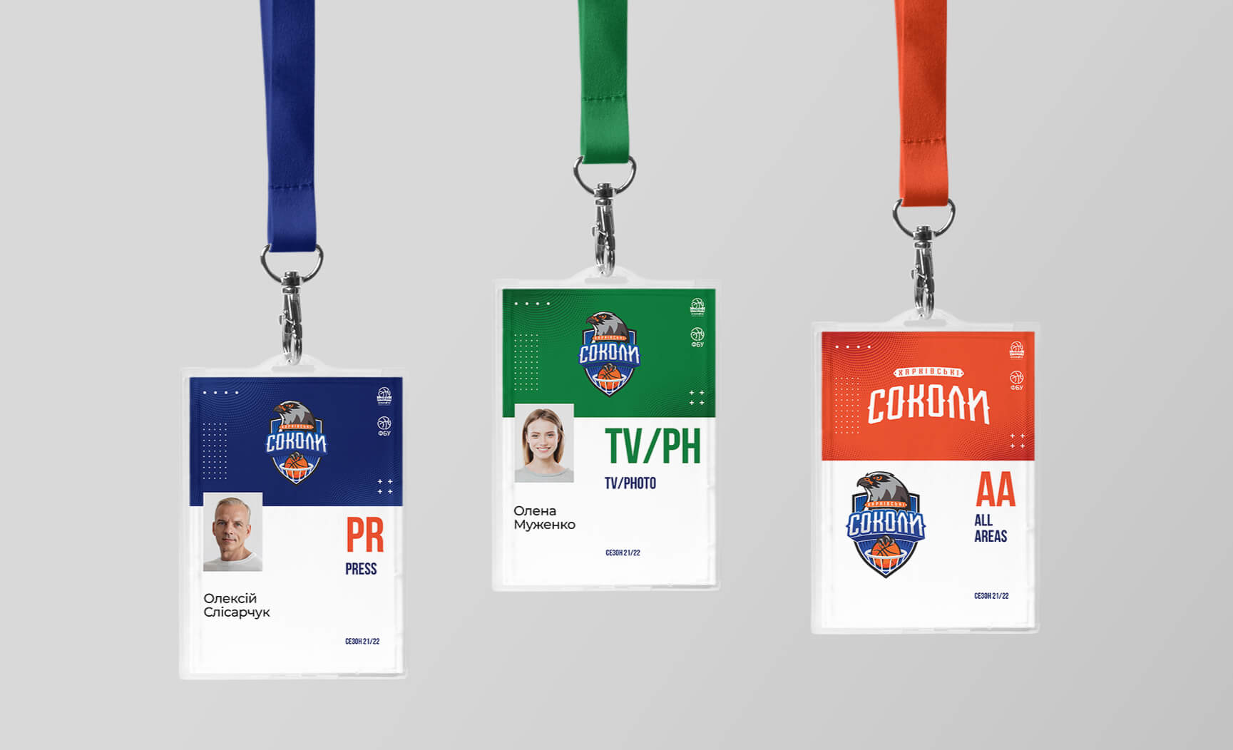
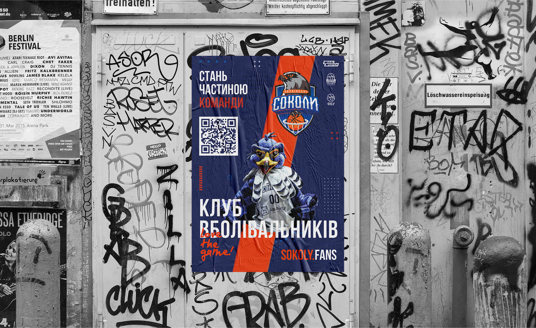
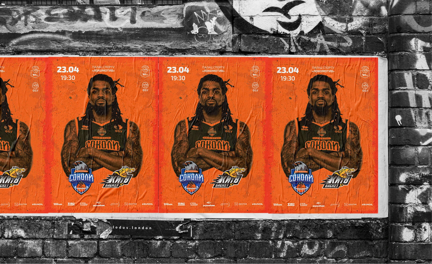
Task: Logo and external communication style for a professional basketball club. We chose the well-known NBA club stylistic approach for designing the club’s logo. Of course, the main character is the falcon.
“Speed and precision. A fight for every ball, for every rebound. From above — straight to the target. From the top, into the hoop. Uncompromising hunters who forgive no mistakes from the opponent.
Speed and precision. A battle for every ball, for every rebound. From above — straight to the target. From the top, into the hoop. Uncompromising hunters who forgive no mistakes from the opponent. A swift gaze and a vision of the battlefield. A flap of the wings, soaring through the air, and coming down with force. A game where there is only one winner. The ball in the claws, the ball in the basket.